
The Challenge Jersey. It’s an underrated gem that changes every season. While some fans don’t care much about the jerseys, others seem to fantasize about their favorite competitor wearing their favorite colors.
I’ll admit, I started out as one of the people in the earlier category. I thought the jerseys were cool, and a good way to distinguish competitors once they left the big team format, but not all that important. While I still don’t think Jerseys are important, I do enjoy seeing the changes and branding for each season.
Not every season has its own jersey. Fresh Meat 1 was the first season to have some jersey variation. Prior to this, one team wore blue and the other wore red (or pink, for Battle of the Sexes). This was the way we knew who was competing with whom. Because Fresh Meat gave us 12 teams, there were 12 colors used to differentiate the teams. A few seasons later, starting with The Gauntlet 3, Under Armour would become the official sponsor of Challenge gear and their logo would be prevalent. I’ll be honest, I love this product placement. It makes The Challenge seem more official and the jersey quality significantly improved once Under Armour became involved. Under Armour’s partnership with The Challenge is the second most important product partner ever, right after reading clues on my T-Mobile Sidekick 2.
In this post, I am going to rank every single Challenge jersey we’ve seen thus far. Fresh Meat will be the earliest season, and every other season will follow. The Island is omitted because there were no jerseys this season. However, Invasion & Champs vs. Stars 2 gets the distinct honor of being mentioned here twice because of the changes in teams.
I love every single jersey. I love that the show has these and they change slightly each season. However, I am going to be very picky here. I’m judging on text placement, graphics, unique variations, colors, and design flaws. Keep in mind, this is 100% subjective and just for fun.
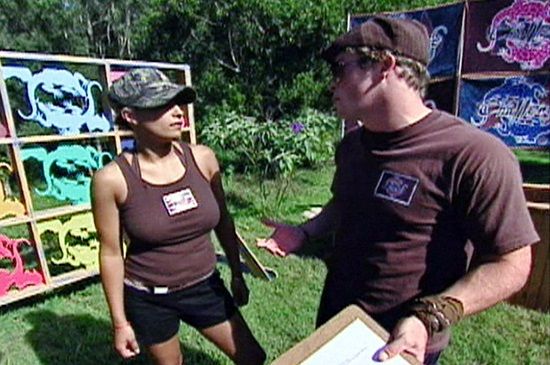
43. Invasion of the Champions (pre-Champions)

- Front: The Challenge, with “THE” being in the border
- Back: Challenger name
- Sleeves: MTV logo on left arm
- My thoughts: There is something seriously blah about these jerseys. At their best, they’re a Rivals 3 clone- the only difference being that men’s jerseys had the Under Armour logo centered. At their worst, they’re the colors you never touched in the crayon box. Seriously, who approved of Anthony’s beige jersey and Dario’s key lime jersey? Then, inexplicably, Bruno and LaToya have the same color but they’re not a team.
42. Fresh Meat
- Front: Lizard logo (men) or Australia logo (women)
- Back: Lizard logo (men) or Australia logo (women)
- Sleeves: Nothing
- My thoughts: I liked this season giving every team their own color! However, the logos are underwhelming. When we boil it down, it’s just a t-shirt with a small picture. At the time, this was the future!
41. Champs vs. Stars 2 (Red & Blue Teams)

- Front: Errea and MTV logos. Name and “champ or star” beneath
- Back: Challenger name
- Sleeves: Nothing
- My thoughts: The jerseys Booby and Tony were wearing are really nice, but there were too many variations. Louise’s jersey is darker, and Wes’s jersey has a weird black line going down it. All players had these minor variations when on Red or Blue teams.
40. Battle for a New Champion

- Front: Challenge logo with competitor’s name beneath and Under Armour logo above it.
- Back: Under Armour logo
- Sleeves: Nothing, jerseys are sleeveless
- My thoughts: These jerseys are nothing unique, but the color scheme is atrocious. The navy and orange is an odd combo, but the orange tights are truly awful. At times, it looks like cast members are dressed to work at a construction site.
39. Final Reckoning

- Front: The Challenge, Under Armour logo, small name under Challenge logo
- Back: Nothing. Nothing at all
- Sleeves: Nothing
- My thoughts: I don’t mind the front, but the back being blank is annoying. However, we’re at the point where people have their names on their shorts, so we can always check someone’s ass if we want to know who they are. My biggest problem: the colors suck. They remind me of the colors in a crayon box no one uses. They’re close to usable, but not quite a color anyone wants.
38. Battle of the Exes

- Front: Challenger name, Under Armour logo
- Back: Huge Battle of the Exes logo
- Sleeves: Nothing
- My thoughts: I liked the colors this season, though most were brighter hues than normal. The Battle of the Exes logo is quite large and seems out of place and it looks like the designer accidentally bolded all the text on these jerseys before printing them.
37. Cutthroat

- Front: Under Armour logo, Challenger name
- Back: “The Challenge Cutthroat” and gulag logo
- Sleeves: Nothing
- My thoughts: These jerseys look cool, but placing the logo on the back is a design flaw in my opinion. The Cutthroat logo is barely legible. Names on the back would have been better.
36. All Stars Rivals

- Front: Gold “The Challenge All Stars” logo and TYR logo (sometimes)
- Back: Competitor’s name
- Sleeves: Nothing
- My thoughts: There’s nothing super wrong here, but these jerseys could have had more. Fans love when pairs have their own unique jersey colors, but we didn’t see it this season. Instead, the jerseys are basic and somewhat boring, “Rivals” isn’t even printed on them.
35. The Gauntlet 3

- Front: Nothing but an Under Armour logo
- Back: Gauntlet 3 logo and name
- Sleeves: Nothing
- My thoughts: This season introduced Under Armour to The Challenge, but that doesn’t make the jersey any better. The fronts are awfully plain, and The Gauntlet 3 logo made no sense. The bones making up the “III” had no place in the theme of the season.
34. Challenge: World Championship

- Front: Challenge logo, player name, country flag
- Back: Nothing
- Sleeves: Nothing
- My thoughts: The prints we see are fine, and I like that different countries have different jersey colors. But, there’s so much wasted space on these and they could have at least added players’ names to the backs.
33. Champs vs. Pros
- Front: The Challenge logo. And “Champs” or “Pros”… usually
- Back: Challenger name
- Sleeves: Nothing
- My thoughts: These jerseys were blatant screen prints and not the best quality logos. My biggest qualm: sometimes they say “champs” and sometimes they don’t.

32. The Challenge: USA

- Front: The Challenge logo, player’s name, and Under Armour logo.
- Back: Under Armour logo.
- Sleeves: Nothing
- My thoughts: I understand this spin off is going back to the basics, but this design is beyond boring. The player’s name isn’t even on the back of the shirts.
31. Spring Break Challenge

- Front: Team name
- Back: “Spring Break Challenge 2010 (MTV logo)
- Sleeves: Just a white mark, not a logo
- My thoughts: I kind of like these, even though they don’t identify the competitors individually. The back has a very simple logo that is reminiscent of a free college shirt. Given this is the Spring Break Challenge, that works. The only sad thing here is the “2010.” Granted, this was filmed in 2010, but adding a date implies there will be a second season filmed the next year. There wasn’t.
30. Ride or Dies

- Front: Challenge logo, competitor name, Under Armour logo
- Back: Under Armour logo at the neck
- Sleeves: Nothing
- My thoughts: This feels like a reskin of Spies, Lies and Allies and Double Agents, but the purple text doesn’t really show too well on the charcoal jerseys. Plus, the most fun thing about those seasons — the country flags — are gone.
29. Challenge: All Stars 2

- Front: Challenge logo, Reebok logo above and center on the green shirts or the logo on the left on the black shirt.
- Back: Competitors’ names
- Sleeves: Nothing
- My thoughts: It’s a bit odd that the placement of the Reebok logo isn’t uniform, but not a big deal. My real criticism is the weird green color. It’s nearly black and can be hard to tell apart in the wrong lighting.
28. Total Madness

- Front: Green challenge logo, competitor name, country flag above logo, Under Armour logo
- Back: Nothing
- Sleeves: MTV logo
- My thoughts: I like the black and green contrast, but the front is incredibly cramped. The back is wasted, and the country flag is useless because this didn’t end up being a War of the Worlds.
27. Vendettas

- Front: The Challenge, MTV logo on the right, and Under Armour logo
- Back: Challenger name
- Sleeves: Nothing
- My thoughts: There’s nothing wrong here, but the placement of the word “The” and the MTV logo always irked me. However, this season does get props for the amount of swag it gave competitors. This is the first season where they got “The Challenge” hoodies and jackets, and the bottoms changed from the typical black to gray.
26. Champs vs. Stars

- Front: Champs or Stars and Challenger name. Under Armour logo is lower on the shirt
- Back: Challenger name
- Sleeves: MTV logo
- My thoughts: I like these! Slightly different, but they were cleaner than the Champs vs. Pros jerseys. The jersey colors are reminiscent of Battle of the Sexes and the text is an odd metallic color. The cast also got a generous amount of other team clothing.
25. Double Agents

- Front: Silver challenge logo, competitor name under logo, country flag above logo. Some jerseys have Under Armour logo at bottom hem.
- Back: Nothing or Under Armour logo, depending on cut of shirt.
- Sleeves: MTV Logo
- My thoughts: This is almost a copy of Total Madness, but the coloring is more subtle than the bright green. Removing the Under Armour logo from the top of the shirt makes the jersey less cramped. Bonus for all of the gear the cast is getting: helmets, puffer jackets, hats.
24. The Ruins

- Front: Huge Ruins logo, Under Armour logo
- Back: Challenger name
- Sleeves: Nothing
- My thoughts: I liked the white on the sides of these jerseys, and I like the darker colors this season. The Ruin logo isn’t really legible, but I did like that the season logo was on the front.
23. Fresh Meat 2

- Front: Huge Fresh Meat 2 logo. Under Armour logo
- Back: Challenger name
- Sleeves: Nothing
- My thoughts: Like the Ruins, liked the white on the sides of these jerseys, and I like the darker colors this season. The odd Fresh Meat 2 logo isn’t the best and looks like it’s stylized to appear painted on, but at least I can read it.
22. The Duel 2

- Front: Huge The Duel 2 logo, Under Armour logo centered
- Back: Challenger name
- Sleeves: Nothing
- My thoughts: The Duel 2- Fresh Meat 2 was an era of huge logos, and The Duel 2 was the best one. I oddly liked the tribal design and it was noticeable enough without being overbearing.
21. War of the Worlds 2

- Front: Challenge logo, team’s flag above the logo and to the left. Player name below the logo and to the left.
- Back: Challenger’s name in big yellow text
- Sleeves: MTV logo on the left.
- My thoughts: This season was a downgrade from the first War of the Worlds. The front has more text. The colors are odd, with black camo and an odd leafy camo print that can also be found on Crocs.
20. Spies, Lies and Allies

- Front: Challenge logo in the center, player name underneath to the right, country flag centered
- Back: Nothing
- Sleeves: Nothing
- My thoughts: I like the navy and silver color scheme. It’s also cool that they have track jackets with the challenge logo and their country of origin. This is a simple jersey, but it contains all necessary information.

19. Battle of the Eras (Individual)

- Front: TYR logo, The Challenge logo
- Back: Challenger name
- Sleeves: Nothing
- My thoughts: I don’t mind a simple jersey; basic as this one is, it’s nice and clean. My biggest issue here is the removal of the shield from the team portion of the game. It was the distinguishing feature from this season, and TJ said competitors were still representing their eras in the individual portion. Plus, the helmets no longer match jersey colors once all jersey became black.
18. Rivals

- Front: Name and Under Armour logo in the center
- Back: “RIVALS” in huge text, almost looking like it was sliced in a game of fruit ninja
- Sleeves: Nothing
- My thoughts: These jerseys have a cool design on them, even though the Rivals logos look like someone played Fruit Ninja on it. I would just switch the location of the logo and Challenger names.

17. Challenge: USA 2

- Front: The Challenge logo, competitor name, TYR logo on upper left shoulder
- Back: Nothing
- Sleeves: Nothing
- My thoughts: Basic jerseys can be great, and this one looks fine. But, it borders on too simple, especially without the person’s name on the back. This season does get props for the four colors we saw (red, blue, black, and green) and there are some cool accessories like knit hats and hoodies.
16. Champs vs. Stars 2 (Champs & Stars teams, Partnered Teams)

- Front: Name front and center, “Champ or Star” beneath. “errea” and MTV logos
- Back: Challenger name
- Sleeves: Nothing
- My thoughts: I really liked the changes here. The names were very visible, team name directly below. The piping on the jerseys resulted in cool styling. These were my favorite spin off jerseys.
And now, we get into a series of very similar jerseys. From Exes 2- the beginning of Invasion we had fairly consistent jerseys. This is not bad! I liked these simple jerseys and they were good branding for The Challenge.
15. Challenge: All Stars 4

- Front: The Challenge: All Stars logo with the 2XU logo in the center (tank top) or on the left shoulder (short sleeve)
- Back: Challenger name, “X” logo below the neckline
- Sleeves: Silver piping on short sleeves
- My thoughts: This is a simple, basic jersey. It’s done well, but it is fairly forgettable. The shoulder logo placement is slightly odd, and the silver sleeve lines almost look like a reflective element for running at night (which this cast never did).
14. Battle of the Exes 2

- Front: The Challenge, MTV logo, Under Armour logo
- Back: Challenger name
- Sleeves: Nothing
- My thoughts: These are simple, basic colors, but they worked well. I liked the jerseys were toned down and I even preferred “The Challenge” rather than the actual season name in many cases.
13. Battle of the Bloodlines

- Front: The Challenge, Under Armour logo- centered for women and on the left for men
- Back: Challenger name
- Sleeves: MTV logo – right arm
- My thoughts: Like Exes 2, very simple but they worked well! I prefer the MTV logo on the sleeve- only real difference.
12. Rivals 3

- Front: The Challenge, Under Armour logo- centered for women and on the left for men
- Back: Challenger name
- Sleeves: MTV logo -left arm
- My thoughts: Almost the exact same thing as Bloodlines, but the MTV logo is on the left and not the right. It’s much better on the left. It’s a fact, don’t fight me. Also, I ranked Rivals 3 higher because it had a few more jersey colors.
11. Challenge: All Stars

- Front: The Challenge logo in gold. Under Armour under collar.
- Back: Challenger name, Under Armour logo
- Sleeves: Nothing
- My thoughts: More recent seasons have added to the jerseys and made them overly complicated. All Stars tones it down, and it looks great. The metallic gold fits the theme well though it provides a level of glare while filming.
10. Invasion (Champion/ Underdog Teams)

- Front: The Challenge logo. Under Armour logo on the right
- Back: Challenger name
- Sleeves: MTV logo -left arm
- My thoughts: It has been so long since we saw proper team jerseys, and these were great! Simple text, but the white sides were a change from the norm. Unlike the teams on Bloodlines, it seemed like there was something unique about being part of the team.
9. The Duel

- Front: Brazil flag
- Back: Challenger name
- Sleeves: Nothing
- My thoughts: I fully acknowledge a lot of funky colors were used this season, but I loved these jerseys. Simple, paid homage to Brazil (whose flag was used in The Duel logo), and this was the first season to put names on the back. However, after the first couple of episodes many competitors saw their jersey color change.
8. Rivals 2

- Front: Challenger name, Under Armour logo centered.
- Back: “Rivals 2”
- Sleeves: Nothing
- My thoughts: This is a simple jersey, but I loved them. Rivals 2 was very prominent on the back, Challenger name prominent on the front. A simple jersey perfected!
7. The Inferno 3

- Front: “Inferno 3” logo
- Back: Challenger name
- Sleeves: Nothing
- My thoughts: This is the first time we saw team jerseys, and I loved them! The Inferno 3 logo is great, with the fiery 3 fitting the Inferno well. Names on the back are simple but nice. Nothing to complain about at all!
6. Challenge: All Stars 3

- Front: The Challenge All Stars logo, Under Armour Logo, and stars
- Back: Challenger name
- Sleeves: Nothing
- My thoughts: This season has a nice, clean, simple shirt. But it gets major props for using the stars so creatively and updating jerseys as the competitors win.
5. War of the Worlds

- Front: The Challenge logo
- Back: Challenger name
- Sleeves: Country of origin’s flag on the left arm, MTV logo on the right.
- My thoughts: I really liked the change of pace this season in terms of colors. Everything was army green, light brown or camo to fit the War of the Worlds theme. Plus, the print was in yellow to make the text stand out. Adding flags to the sleeves was a huge plus in my eyes.
4. Battle of the Eras (Eras)
- Front: TYR logo, The Challenge logo, shield with era on it
- Back: Challenger name
- Sleeves: Nothing
- My thoughts: I love the four color choices here, and the simple design is great. The shield with the era in Roman numerals is a great touch, but it’s not overbearing. There were a lot of things that went wrong with this milestone season, but this wasn’t one of them.
3. Dirty Thirty

- Front: The Challenge XXX “Dirty Thirty” logo, centered Under Armour logo
- Back: Challenger name
- Sleeves: MTV logo- left arm
- My thoughts: After seasons of just The Challenge on the front, I liked the Change to the huge XXX logo. For the theme of the season, it was pretty badass, and I even liked the standard orange jersey. The daily Challenges introduced different colors which were hit or miss, but the Dirty Thirty logo was super cool and makes this jersey one of the best.
2. Battle of the Seasons

- Front: Challenger name, Under Armour logo on the left
- Back: Battle of the Seasons logo
- Sleeves: Real World season subtitle… or “Fresh Meat.”
- My thoughts: A clean jersey, but it gets major props for doing something unique with the sleeves. I also liked the color varieties this season.
1. Free Agents

- Front: The Challenge logo, white borders (thinner for women), MTV logo on left, Under Armour logo on right
- Back: Challenger name and randomly assigned number
- Sleeves: White borders
- My thoughts: Everyone knows Free Agents was the best because of the random numbers on the back. People love to think of The Challenge as a sport, and the numbers make it seem more official. Especially during Free Agents, it was a great touch. This was also the first season to replace the season logo with just “The Challenge.” To be honest, I prefer that. This season also featured other color jerseys for daily challenges without a white border, but they’re very similar to Exes 2.


No the first season to start using “the challenge” was Fresh Meat 2
Well, you’re technically right. That season lost the Real Word/ Road Rules. However, they used season logos rather than just “The Challenge” like Free Agents or Exes 2.
The Rivals-Exes-Seasons-Rivals II jerseys were the best ones. I miss those.